Selling Socrates.
Feeling the quality before experiencing it.
Client
Management Development Consultancy
Expertise
Brand Strategy
Brand Positioning
Brand Identity
Brand Communication
Brand Guardianship
In a nutshell
This client had been positioned as a tick-box training company for 10 years. But in reality, they were the antithesis to it. The challenge was to help them break out of the mould and convey the effectiveness of their highly sophisticated and confidential work to potential clients.
The problem was that while their difference lay in their approach to people development, all of their communication focused on programme content. The solution was to generate a brand experience and content strategy that was designed to reveal how this company thought and the problems they solved, rather than the topics they addressed.
When the new brand launched, the difference could be felt across every touchpoint. Since the re-launch, they have not had to make a single sales call or participate in a single tender. They are understood as being incomparable to other training companies in the industry.
5 minute read
Insight
When we try and speak to everyone, we often end up reaching no one. It’s rare, even unheard of, for “everyone” to be our target audience. And speaking to everyone results in a generic discourse that doesn’t delight or intrigue. When you have something unique to offer, it’s better to try and reach a handful of your super fans rather than thousands of people who will never be interested in your service anyway.
In the case of this client, explaining their work and selling their services had been an uphill struggle from day one. Feedback from existing clients showed that they never would have thought to work with this company had they not been referred. Others commented on the fact that discussions with consultants felt nothing like what they read on the website or in the brochure.
Because they had been focusing on competing for the same clients as the competition, they had ended up with the same discourse and had lost their unique voice. Looking at their website you would think they were —just another tick-box corporate training company. And yet, this was a company you called when you wanted to deliver lasting behavioural change in an organisation. The key insight here was that this company was not for everyone.
Our solution was to bring all communication in line with how the consultants actually talked and worked. The goal was to convey the unique qualities of their method and attract the right kind of client, clients who were looking for a long term change, while eliminating those who were looking for a quick fix solution.
What we did
The essence of this client's work was to get people to slow down, ask questions and think differently.
— We set out to design a brand universe that would do the same, giving people a feeling of what it might be like to work with them.
1.
A New Brand Universe
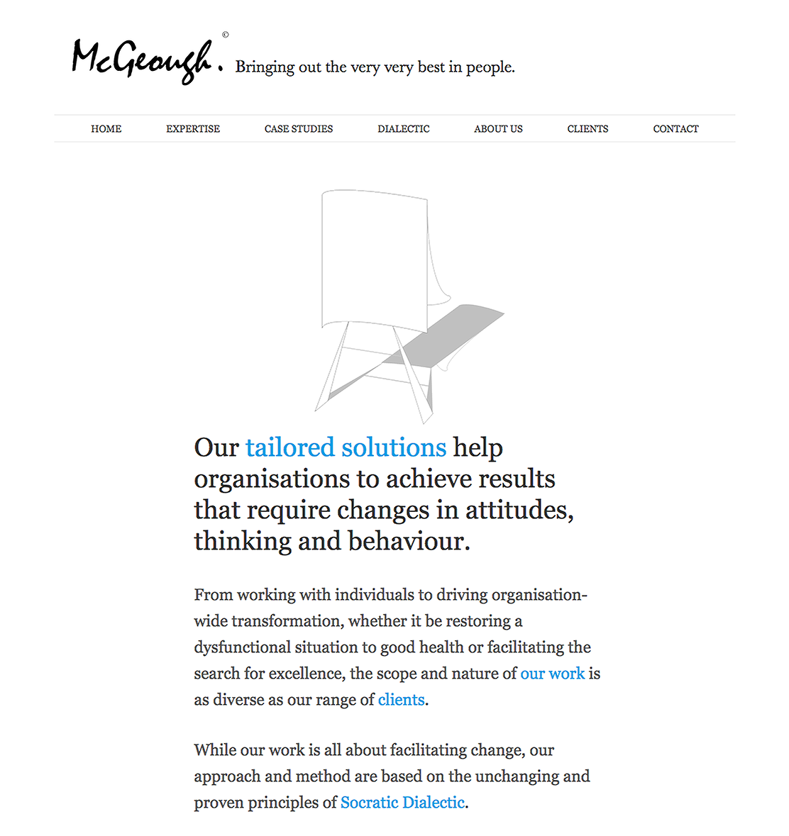
With this consultancy, we are in a universe which is dedicated to creating space for people to think things through. Client feedback revealed that they found the approach refreshing, thought-provoking, practical and miraculous. The new brand was designed to evoke feelings of these qualities.
Colours — Intellect & Emotion
We use a lot of white space to create an environment free from clutter and conflict. We are invited to calm down, read with care and eliminate distractions.
The use of black and white conveys the premium nature of the work and evokes simplicity and clarity and pragmatism.
The sky blue accent color is refreshing and brings touches of light and joy into the communication. It has a positive, energetic feeling that conveys warmth, passion and optimism.


Typeface — The Functional & the Beautiful
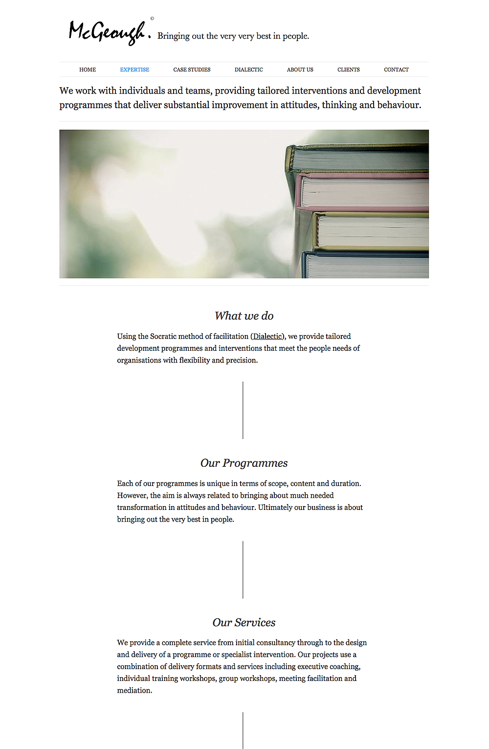
Because of the content-heavy communication strategy, creating a beautiful and easy reading experience was the priority. The typeface Georgia was selected because it is one of the best in terms of readability on the web, working equally well at both small and large sizes.
Striking a perfect balance between the functional and the beautiful, Georgia was designed to improve clarity which mirrors the business of this client.
Georgia also has a certain authority and prowess which convey trustworthiness and sincerity and yet it exudes friendliness and charm.
Structure — Designed to be Read Slowly
All content is designed to be read easily with no distractions. By structuring content as a series of articles or white papers, the user is invited to slow down and enjoy reading, a rare experience for a corporate website.
All communication, from proposals to programme notes, follows this readable structure which mirrors the reflection, analysis and attention to detail that goes into the programme design.

2.
A New Name
The company was called PSM ltd. which stood for Practical Stress Management. It was a leftover acronym that was linked to the fact that when the company launched, their focus was on stress management. But this name no longer had any meaning or link with the company’s work today. The company needed a new identity that would reflect the pioneering approach developed by the founder and the human, people-lead values they championed.

Before

After
We proposed that the company change it’s name from PSM ltd to the name of the founder. Associating the image with the experience and reputation of the founder conveyed the human, personal and unique approach they had become known for with existing clients. In addition, it shifted the focus away from the topics they addressed.
3.
Aligning Marketing Strategy with your Philosophy
At the time of our intervention, this consultancy was still promoting a range of public two-day training programmes. But the very existence of these programmes was in conflict with their belief that you can’t develop people in two days, changing human behaviour takes time. We proposed that they stop any activities that were in conflict with their philosophy. So the two-day programmes were cut. This had two immediate benefits:
- It removed the costly and time consuming efforts to fill the programmes freeing up staff time to work on in-house programmes;
- It eliminated the need to promote something that was not aligned with their philosophy. They were finally able to say with total confidence and clarity that this was not a company that offered tick-box training.
It’s been 6 years and the public programmes have never been reinstated.
4.
From Covering Topics to Solving Problems
A key difficulty for this client was the time wasted explaining how the Socratic method worked. It turned out that in meetings, consultants always gave real life examples. So we developed a series of 12 case studies that acted as a showcase for the work and enabled potential customers to understand in an instant the range of problems that could be solved.
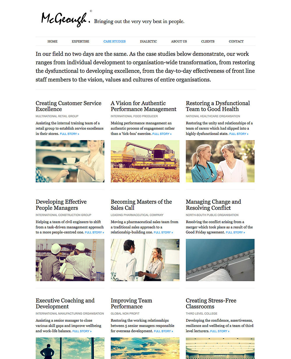
The home page of the case study section allows potential customers to get a snapshot of the range of problems they deal with as well as the industries and types of organisations they serve.
5.
Selling Socrates
In the past, this client had avoided saying too much about their approach which was based on the Socratic method of Dialectic. The fear was that it might alienate potential clients and give people an impression that their work was too academic or out of touch. But their Socratic approach was their key differentiator. We agreed with them that in the new positioning, the method would take centre stage. Over the course of several workshops, we helped this client give structure and form to their method, creating a detailed, logical and common sense explanation of how it worked and why.
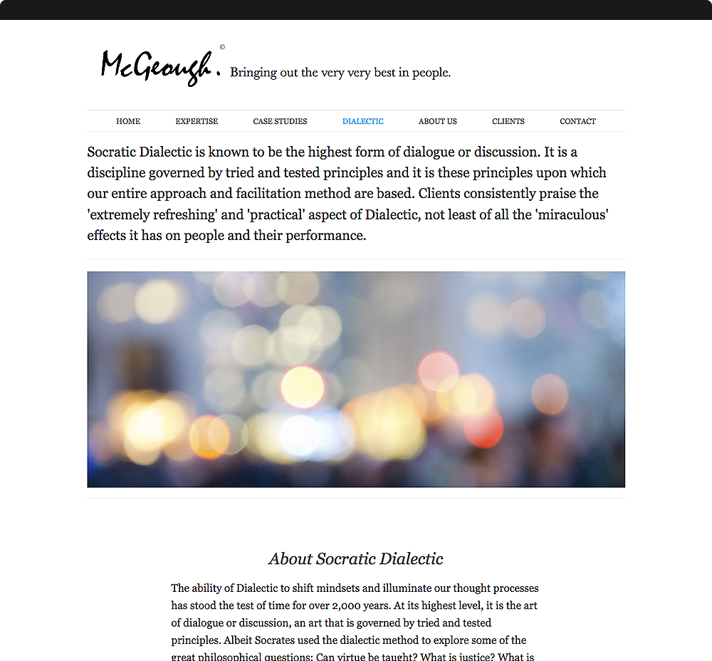
Dialectic was featured in the main navigation menu with an entire section dedicated to explaining exactly how it worked and the benefits it generated.

Results
The invisible made visible.
Since the launch of the new brand, content and communication strategy, this client has not had to make a single sales call.
All business has been in calls. They have not had to engage in a single tender. They are contacted directly by business owners, CEOs and leaders who understand that the value they bring is unparalleled in the training industry.
In addition, there is not a single detail of the brand, communication or ways of working that is out of alignment with their philosophy. If you were to read a case study and then meet one of the consultants, you would find no gap. What you meet via the communication is exactly what you meet in person. This leaves a strong impression on clients and reinforces the perception of expertise, authenticity and depth of experience.
When consultants arrive at meetings with potential clients, it’s not unusual for the client to have already read several of the cases, with some going so far as to print them out and bring them to meetings! In addition, clients use the website to on-board their internal management teams and explain that this is a different type of training so that the usual negative preconceptions of in-house teams are addressed before projects begin. In this way, the communication has had a positive effect on the work itself. When consultants begin new projects they find staff arrive on day 1 with an open mindset and with none of the usual preconceptions linked with standard training programmes.
By stripping away all marketing gimmicks and practices that were no longer aligned with the company’s philosophy this actually freed up more time to focus on what they really cared about.
The most important result of this project was the effect of the design process on the client themselves. We helped them to clarify exactly what their work was about, to distill their method, to refine their business strategy. At the end of the project, it was not just their external communication that had changed, but their own conviction and clarity around what they were about had matured.
We look forward to supporting this client into the future and are eagerly awaiting the next chapter of their communication strategy: the books!
Let’s talk! — We’ll look after you.